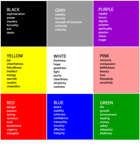
Color
Color adds the magic element to a design. They represent a common language of communication. Each color has a mood, an emotion and different levels of significance. It plays a huge role in design and right color choices can bring about drastic changes in contrast.
Colors can reflect warm or cool, hard or soft, light or dark, passive or active, all of which when used individually or in combination of one another greatly affects the mood. Association of colors form an important part of color language. Red is universally used for danger, green for freshness; each has a unique meaning in different cultures and religions. A good graphic designer should be aware of the general meaning of a color in terms of subject matter and the audience.

Color is always relative, the audience response to a color in association with the environment, other colors and elements around it. Surroundings always emphasizes the meaning of a color.
Types of color
- Primary Colors are the three colors red, yellow and blue that are used to make up all the other colors.
- Secondary Colors: Two primary colors when combined create a secondary color. For example, yellow + blue = green, yellow + red = orange and red + blue = violet
- Tertiary Colors are the colors created by the combination of primary and secondary colors. (e.g. yellow-green)
 A digital graphic designer has almost a limitless color palette to work with. That in another word means it isn’t as easy as one might think to decide upon a good color theme. Good color theme assures a relationship between different parts of a design, like a story. Hence good care should be taken when mixing colors of similar tone and intensity. A change in color intensity or brightness can be used to represent different levels of importance or bring about a hierarchy level.
Attributes of color
- Hue: Hue can be described as the colorfulness of a color. (Redness, blueness etc.) In another words, it indicates the warmth or coolness of a color.
- Value (Lightness):Value refers to the dark or light quality of color. There can a variety of values associated with color:
- Tint is a mixture of a color and white. It increases the lightness of a color, for example adding white to red changes it to pink.
- Shade is a mixture of a color and black, i.e. it increases the darkness of a color. For example, adding black to red changes it to maroon.
- Tone is a value between tint and shade (medium values). It results when both white and black are added to a color.
- Saturation/Intensity: It refers to the relative purity of a color. In other words, it is referred to as the brightness or dullness of a color.
Pattern/Texture
The relative arrangement of elements on a surface creates a structure between them. This structure is called a pattern. When patterns begin to form their own compositions/structures, they are referred to as textures. Textures can be broken down into two forms:
- Physical Texture: The type of texture that you can actually feel, like the surface of a painting, roughness of a paper etc.
- Visual Texture: The illusion of a surface, for example, a picture of the surface of a paper generates an illusion of its rough surface. Digital graphic design is all about visual textures.
For example, below is a visual texture of crumbled paper.
Form
Form is any three dimensional object. They can be measured in terms of height, width, breadth etc. We won’t be discussing about 3 dimensional designs in detail.
Related articles
- Design Basics (teknonics.wordpress.com)
- Beginning with Graphic Design (teknonics.wordpress.com)
- 100 Ideas That Changed Graphic Design [Design] (gizmodo.com)
- Texture is an important element in your custom drapery design! (gailanidesign.wordpress.com)
